My first sketch visualizing my data, I wanted to get all of my data visualized in the simplest way possible to get ideas flowing.
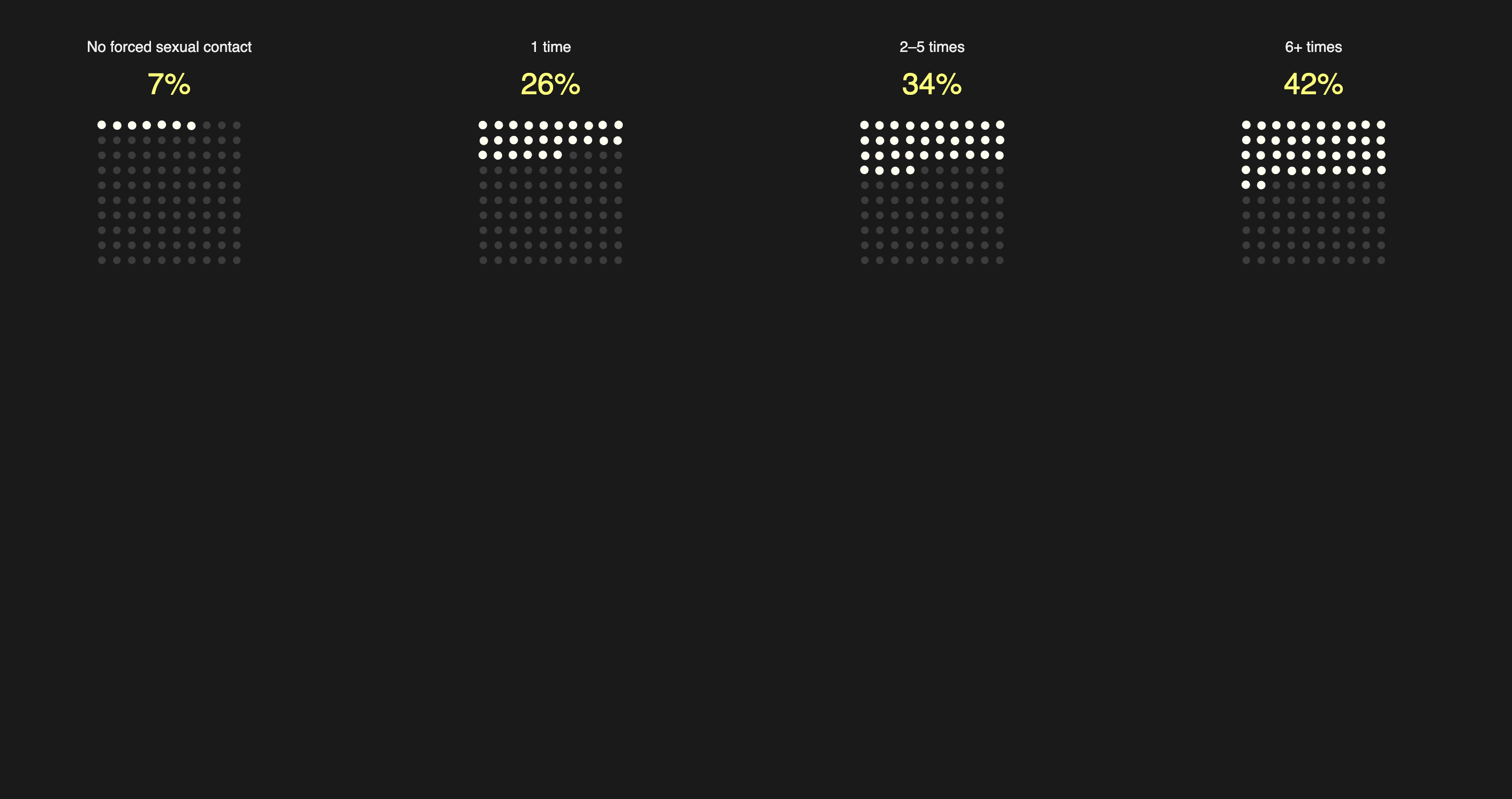
My "resting" webpage, waiting for interaction. You can see the strain the the lines representing LGBTQ youth. My webpage with the maximum interaction representing the percentage of suicides in LGBTQ youth that had experienced 6 or more instances of sexual assault.