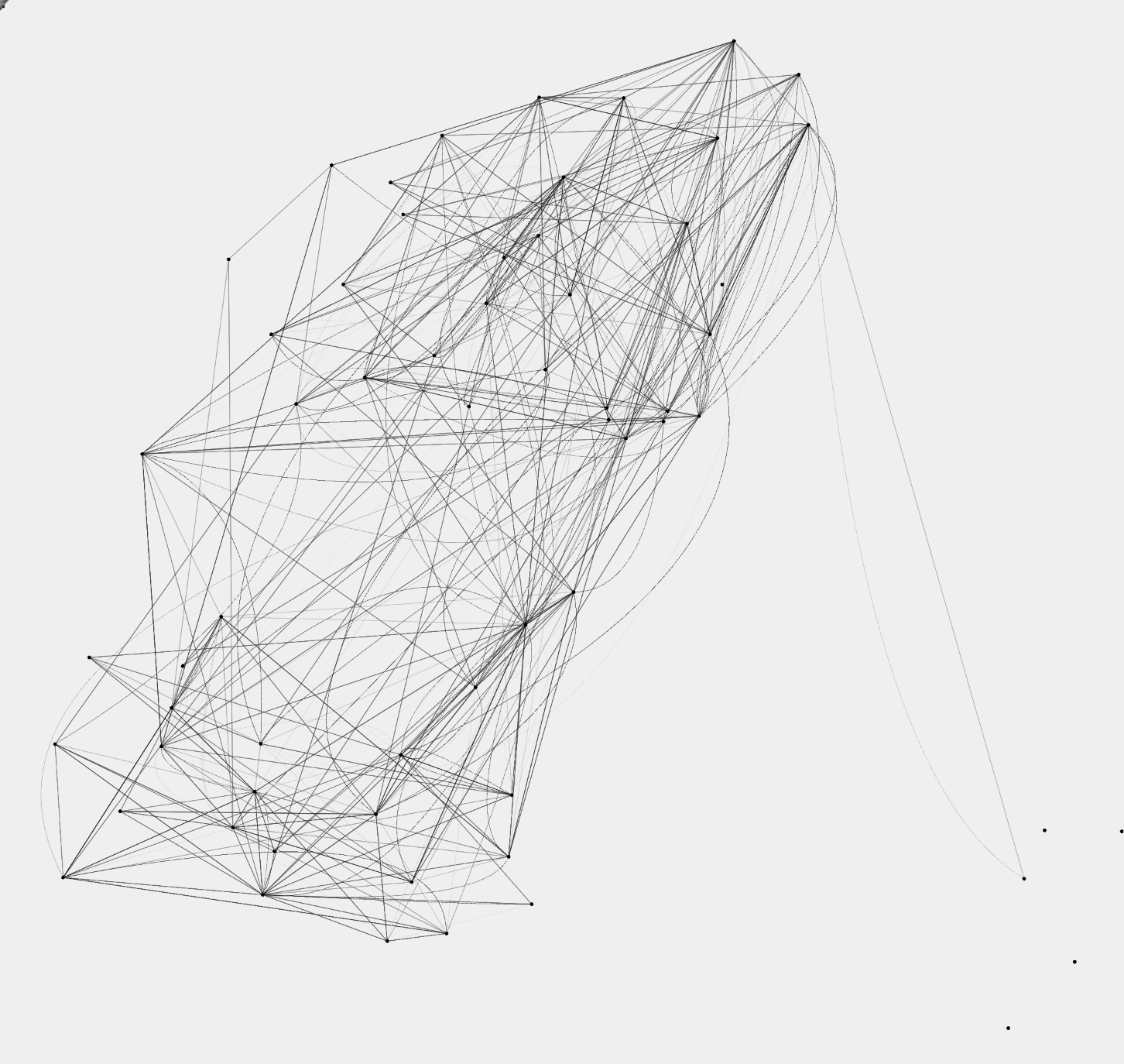
Lines Mode
Shows only straight and curved lines for clearer flow reading
Straight Line = Member
Curved Line = Casual
Lines are rendered thicker / more solid / slower to fade to emphasize path structure
This visualization is based on New York Citi Bike official trip data (CSV). Dots indicate
stations; the time-generated, gradually fading straight/curved lines represent
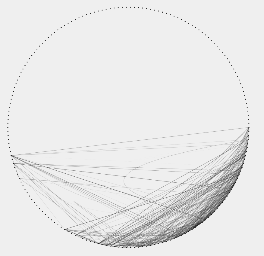
individual ride trajectories from start → end. Mini Radar (top-left)
An abstract global thumbnail of the whole map (not geographically scaled)
Dots = stations; thin links = rides that are currently active or just occurred
Even when the main view is zoomed or panned, the radar reveals overall rhythm and
density—a “city ECG” pulse