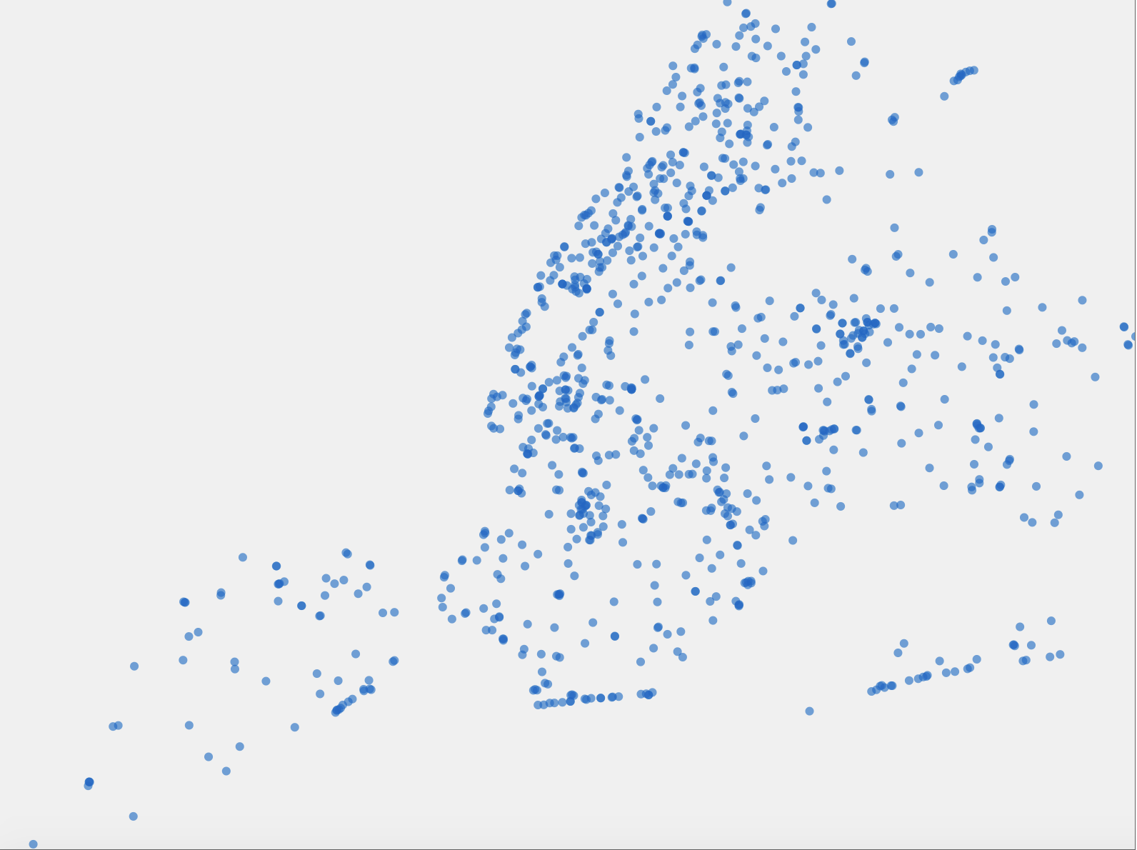
This was the beginning of using the NYC open data set. I wanted to see what it looked like in full across all of New York. The dots indicate each fountain.
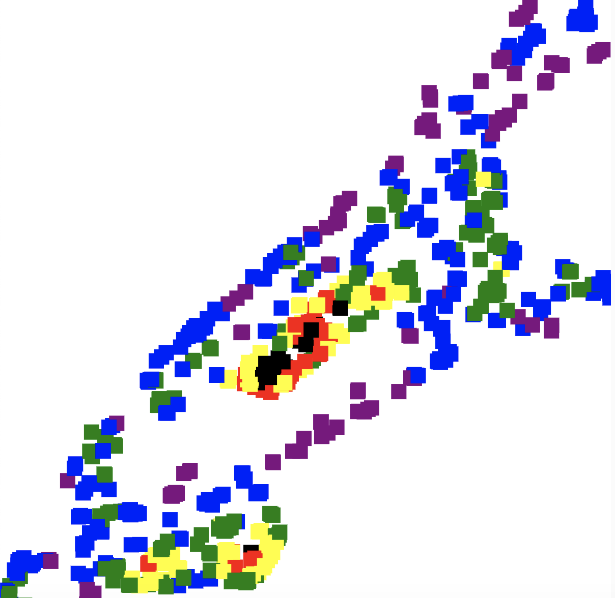
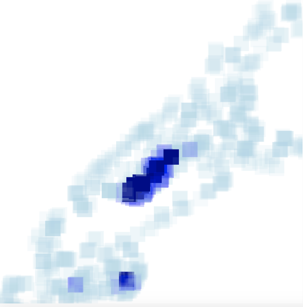
I narrowed it down by borough. I chose manhattan. Each color represents density by 30 pixels. I specified my long and lat to just Manhattan fountains. So I used code to pick out from the array of information. This is my final code. This goes hand in hand with my data sculpture. The opacity indicates the range of low to high density. The one that has a low opacity is low density, medium opacity is medium density, and high opacity is high density.